
AKA Did Jack really have a legit chance of survival?
Overview
Spoiler Alert the Titanic sank. Now, if you've been hiding under a rock, completely blocked any mention of the ship, shipwrecks, early Leonardo DeCaprio films, or even the concept of "was there *really* room for two on that door???" I apologize.
But if you know what happened, let's have some fun with the datasets behind the wreckage.
No need for this to be a tragedy with a completely *sunk* cost. (Ok, I know, I know).

The Question at hand.
(and no, it's not "who made the mistake of skipping dessert?")
Based on the following Titanic datasets (name, age, price of the ticket, etc.), predict who will survive and who will die.
Let's train a learning model to figure out who all survived (and who should have had seconds of the dessert cart!)
Let's start by setting up our environment.
I'm using a browser-based notebook for this experiment, as I've been practicing with datasets off of Kaggle.com, and they have a handy-dandy built-in notebook for this. But the same setup applies if you building in Jupyter Labs as well.
import numpy as np # linear algebra
import pandas as pd # data processing, CSV file I/O (e.g. pd.read_csv)

import os
for dirname, _, filenames in os.walk('/kaggle/input'):
    for filename in filenames:
        print(os.path.join(dirname, filename))
The following should print the filenames to where your files are stored. Consider this a good "check" to ensure you're working with the right files.
/kaggle/input/titanic/train.csv
/kaggle/input/titanic/test.csv
/kaggle/input/titanic/gender_submission.csv
I know I've been there, yelling at my computer when it can't find what I need and I've been building in the wrong tools all day. 🙃
(PSSST — this is also part of the reason I've been loving using Warp as a terminal, the saved commands and history have been super helpful to me in my journey and exploration as I'm leveling up as a developer.)
Let's crack open this data and see what's in there!
train_data = pd.read_csv("/kaggle/input/titanic/train.csv")
train_data.head()
Running the above will provide us with a look at what this data looks like. We'll peek in and scroll around what variables might come in handy as we build here.
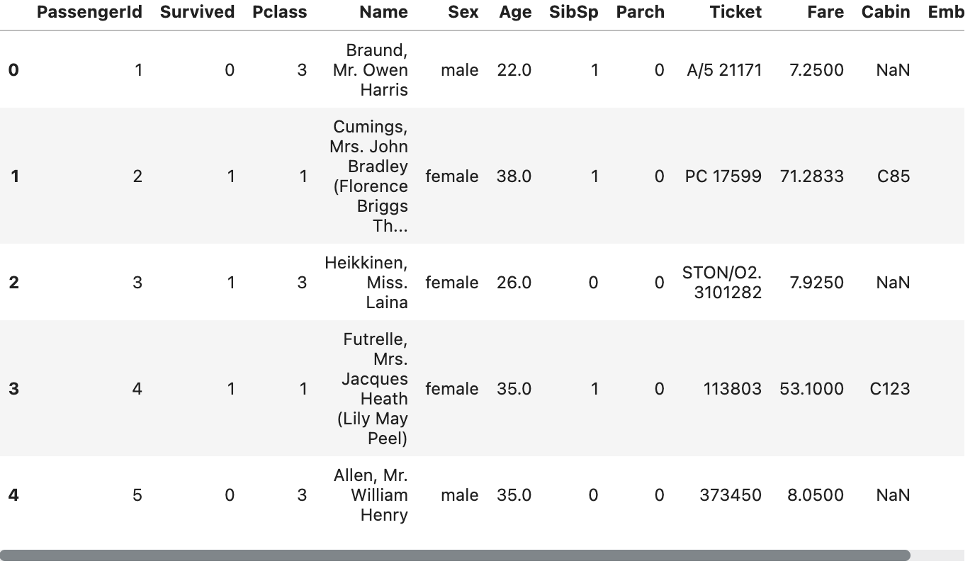
We just used Python in a "module" known as pandas to load the table from the train.csv file into the notebook.
We did this by telling the notebook where the file is located (/kaggle/input/titanic/train.csv) and then telling it to display the data.
We will now load the contents of the test.csv file to start identifying patterns.
test_data = pd.read_csv("/kaggle/input/titanic/test.csv")
test_data.head()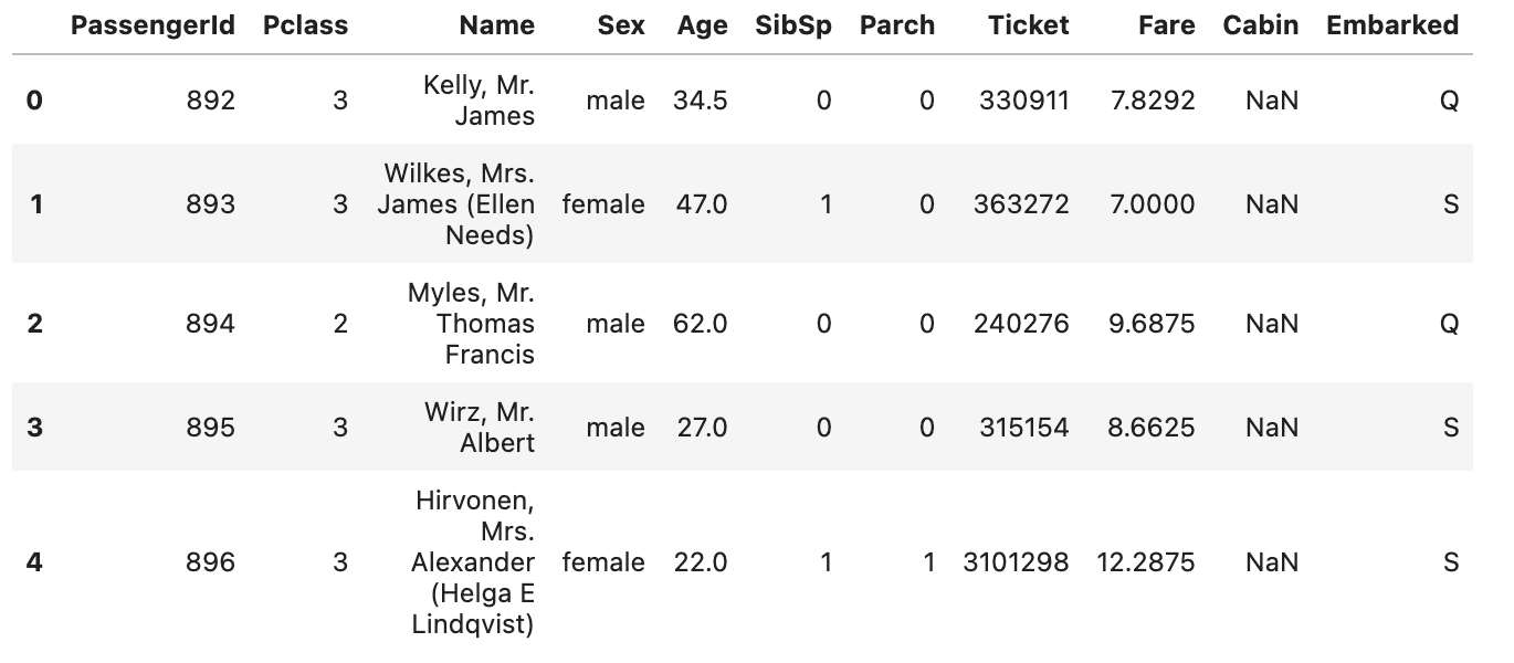
Now that we've loaded and checked these two datasets, it's time to start looking for patterns.
Manually — it would be time-consuming and even quite possibly overwhelming to start looking for patterns, but that's why we're relying on tools like Machine Learning and Python to help us do so!
We'll start by looking at the other data provided. Looking at the gender_submission.csv data, we can see an assumption was made that all female passengers survived (and subsequently, all male passengers died).
Let's check if this is accurate or even reasonable to say. (Dammit, Rose... don't be lying to me now!)
To calculate the number of women who survived the titanic — we can run the following.
women = train_data.loc[train_data.Sex == 'female']["Survived"]
rate_women = sum(women)/len(women)

print("% of women who survived:", rate_women)
% of women who survived: 0.7420382165605095
Now that we've calculated the percentage of women who survived let's check up on the men who survived.
In this dataset, gender is a binary (but we know that in reality, gender is a spectrum, but for the sake of our dataset... they've provided us a binary).
Let's check the remaining men population to see who survived now.
men = train_data.loc[train_data.Sex == 'male']["Survived"]
rate_men = sum(men)/len(men)

print("% of men who survived:", rate_men)
% of men who survived: 0.18890814558058924
Now it's time to interpret our data. This shows that 75% of the women on board survived, while only 19% of men did.
(Chivalry isn't dead after all, but come on! Rose! There was room on that door!!)

Gender seems to be a strong indication of who survived.
Now, let's remember that correlation =/ causation! Just because we know more women survived doesn't mean they merely survived for being women.
We're currently only looking at one column of the dataset as well, not considering more data here. What if the women's bathroom just happened to have life vests when shit hit the fan? What if aliens actually abducted the men? Merely looking at these two sets of numbers does not tell us the full story
We will now use a random forest model, a machine learning model that is compromised of many "trees," to consider all the different factors a passenger might have had and determine if they will (or will not have) survive.
Whoever has the most outcomes wins! Or... ahem... lives a modest life of trauma bonding with other shipwrecked survivors and maybe one day be portrayed by a d list celebrity in a movie with Leo Decaprio in it!
We'll consider the following variables when determining if someone survived (or not).
- Passenger Class
- Sex
- No. of Siblings / Spouses on board
- No. of Parents / Children on board
We'll create trees based on the patterns found in the train.csv file, and then it will generate predictions in a test.csv file.
We'll then save it into a final file titled submission.csv
from sklearn.ensemble import RandomForestClassifier

y = train_data["Survived"]

features = ["Pclass", "Sex", "SibSp", "Parch"]
X = pd.get_dummies(train_data[features])
X_test = pd.get_dummies(test_data[features])

model = RandomForestClassifier(n_estimators=100, max_depth=5, random_state=1)
model.fit(X, y)
predictions = model.predict(X_test)

output = pd.DataFrame({'PassengerId': test_data.PassengerId, 'Survived': predictions})
output.to_csv('submission.csv', index=False)
print("Your submission was successfully saved!")
We now have a CSV of data with two columns, one column with the passenger identification number and the other column if they survived.
This prediction is based on the information we provided, which considers the variables we provided ( Passenger Class, Sex, No. of Siblings / Spouses on board, No. of Parents / Children on board) and tells us what passengers may have survived.
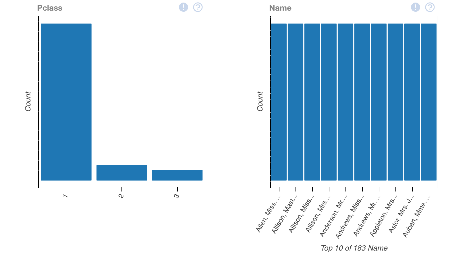
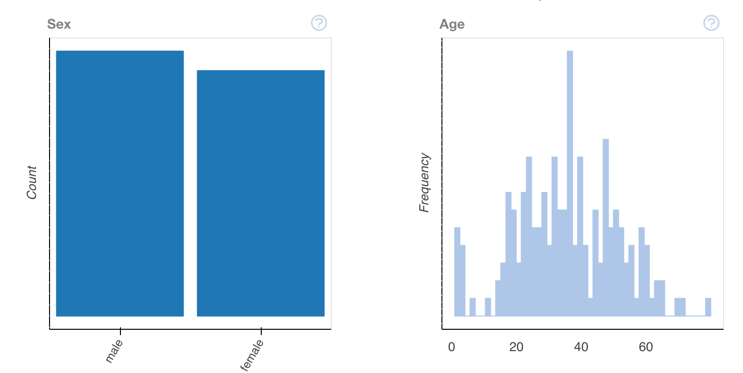
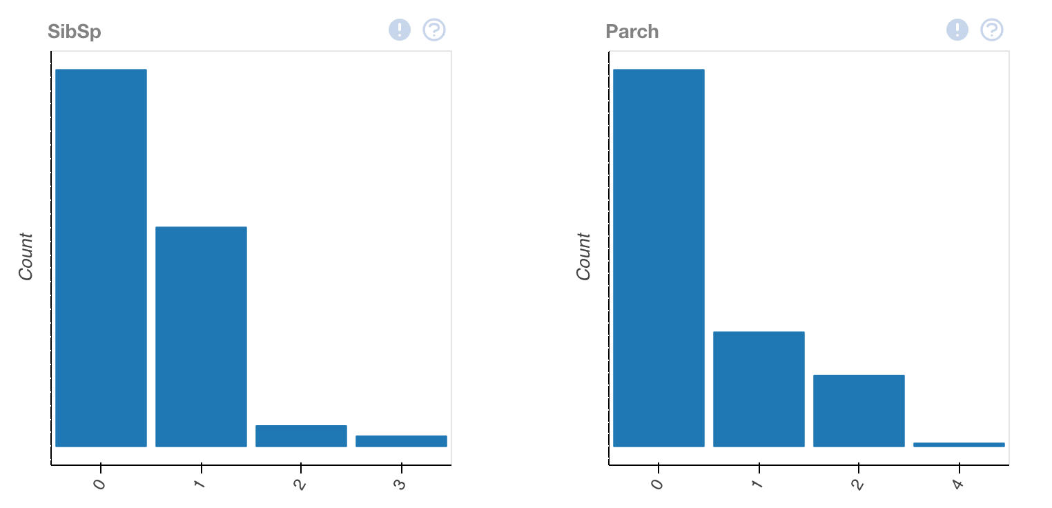
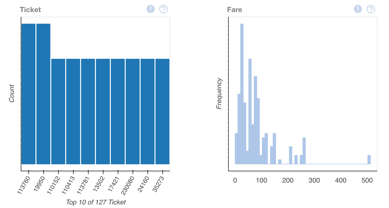
We can start to visualize this data using a tool called DataPrep.
My first encounter with DataPrep happened when I explored and visualized datasets for data journalism projects. It's a great way to start to visualize data with a few lines of python.
We'll first need to install DataPrep through pip. If you haven't used pip before, here's a guide to get started.
pip install dataprepNext, we'll run the command to start to peek at what is inside of the data visually. DataPrep has a function known as plot, allowing us to take a peek at what's happening in each of these columns and tell us what each respective type has in it.
We'll run this by doing the following.
from dataprep.eda import plotThen calling our training data back from the beginning of this tutorial.
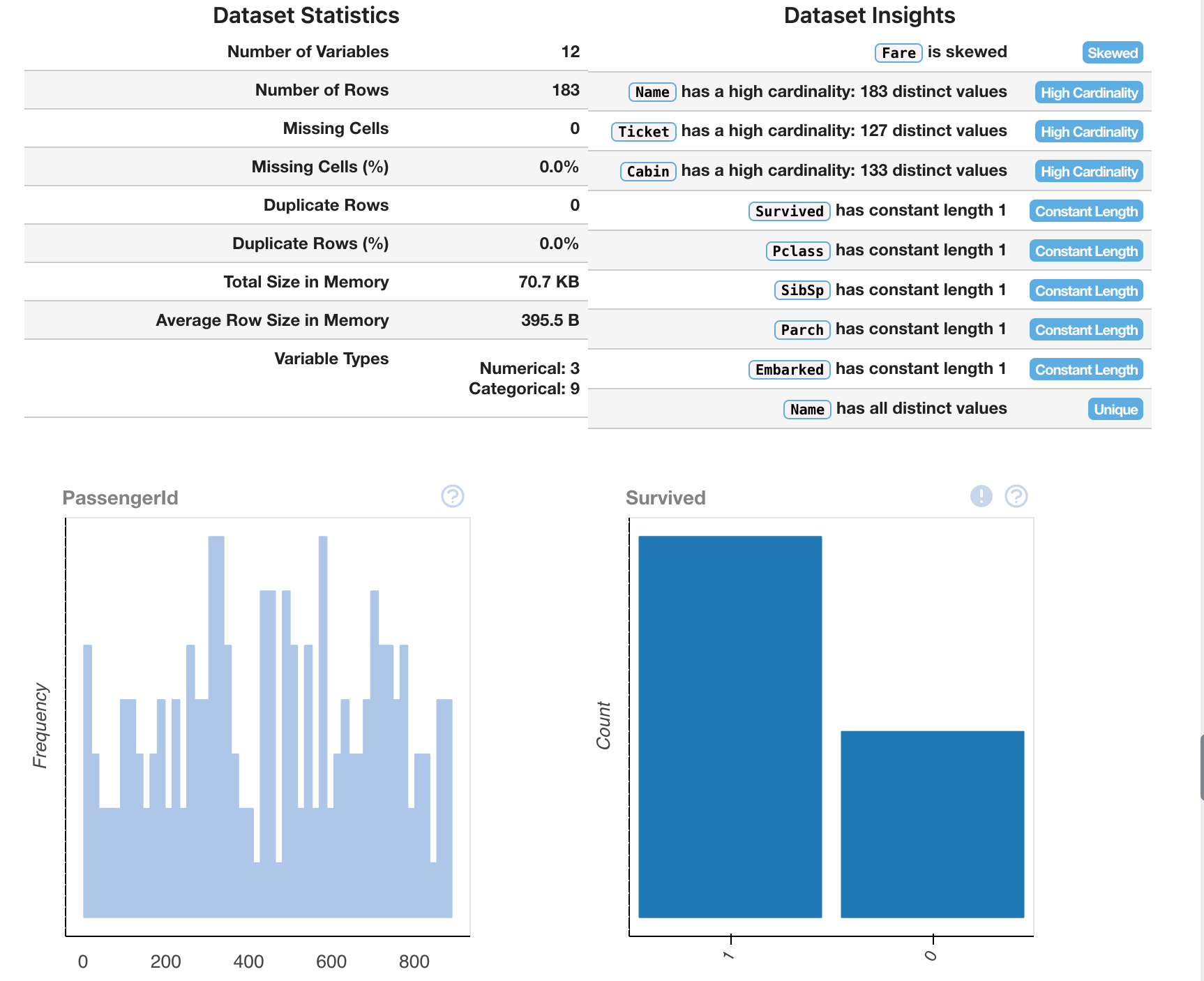
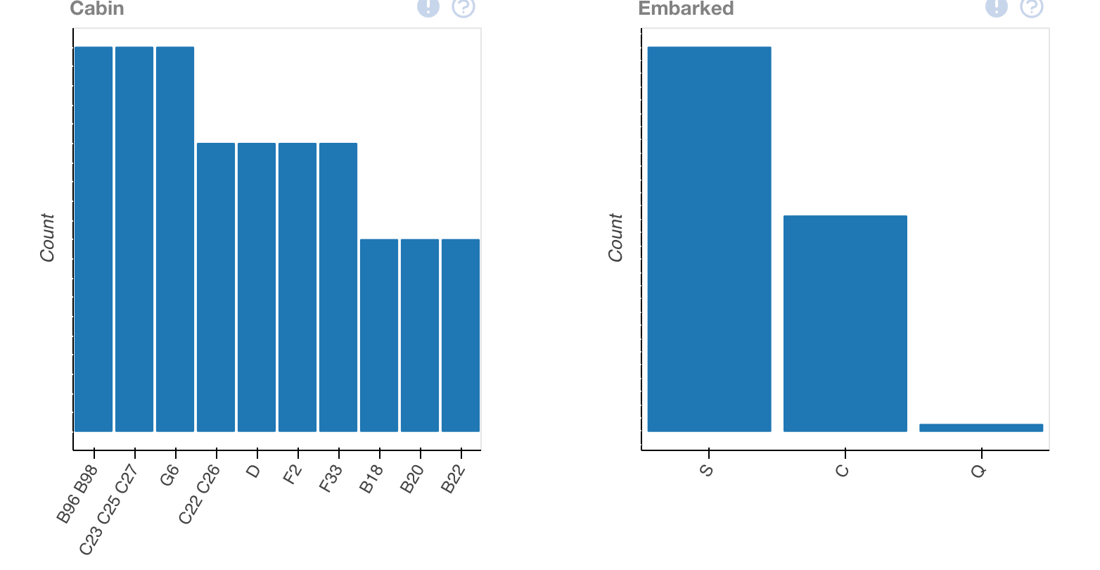
plot(train_data.dropna())This output will provide us with multiple different ways to view the data, allowing us to interpret it better.
Looking at this, we'll have to keep in mind — this is only one data set — we've merely interpreted our csv of training data. In order to gain understanding, we'll have to compare it to the other statistics that we've provided.
Using Machine Learning to predict Titanic Survival Rates.
The Question at hand. (and no, it's not "who made the mistake of skipping dessert?") Based on the following Titanic datasets (name, age, price of the ticket, etc.), predict who will survive and who will die.